One commerce foundation for 20+ automotive brands
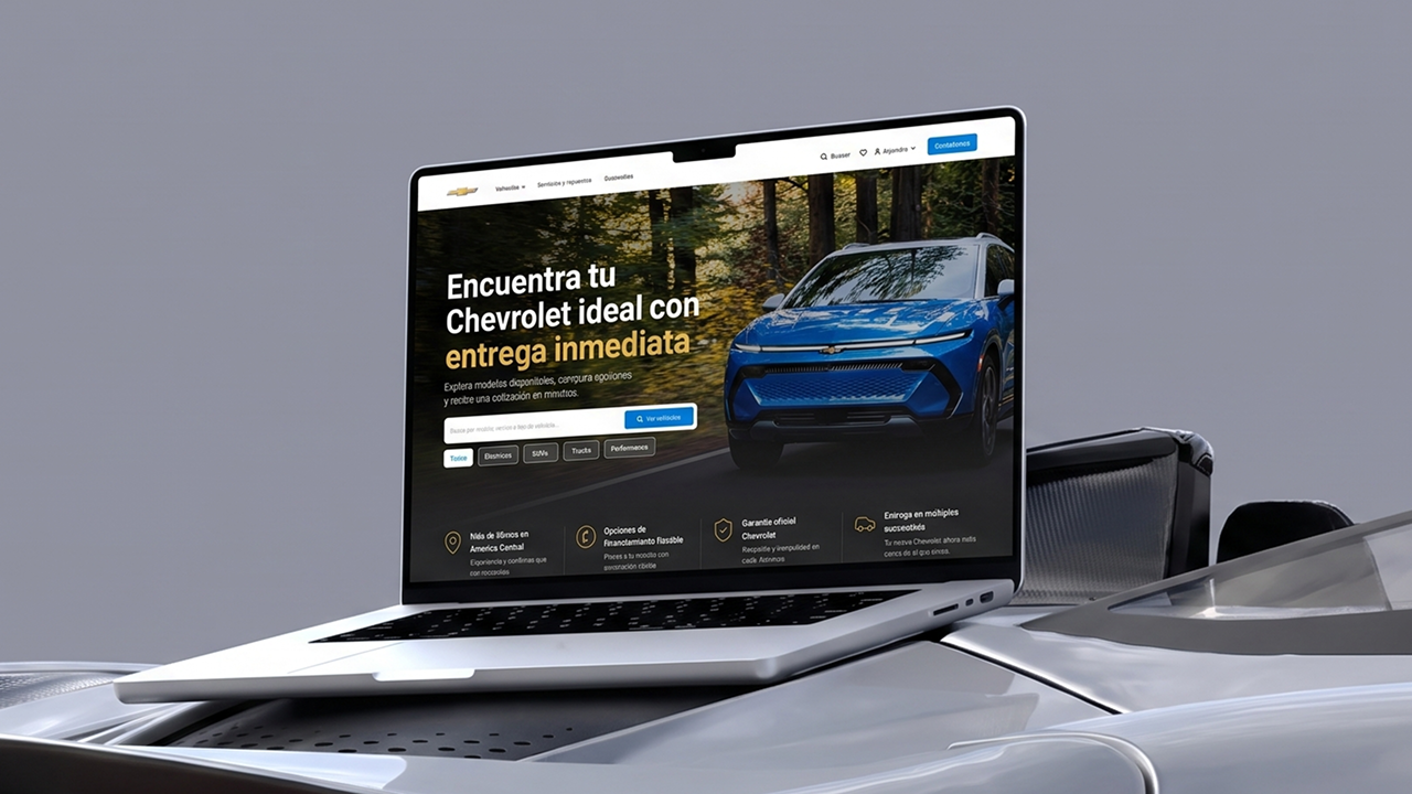
As Lead Product Designer, I shaped a flexible commerce template for a leading automotive group in Central America, bringing vehicle discovery and configuration into one consistent experience.
Context
A leading automotive group was defining a unified Salesforce commerce ecosystem across multiple Central American markets and more than 20 automotive brands.
Impact
I created a reusable UI foundation that could express different brand identities without rebuilding the shopping experience each time.
My role
I led the UI direction, established the multi-brand logic and guided the experience from storefront patterns to vehicle configuration.
Highlights
- Reusable template across 20+ brands
- Scalable design system across brands and markets
- Real-time exterior and interior personalization
Overview
A shared digital foundation for a complex automotive group
A regional digital transformation program connected retail sales, fleets, service, lending and distributor experiences. The business needed one digital foundation that could connect a catalog of more than 5,000 vehicles while preserving the identity of every brand.
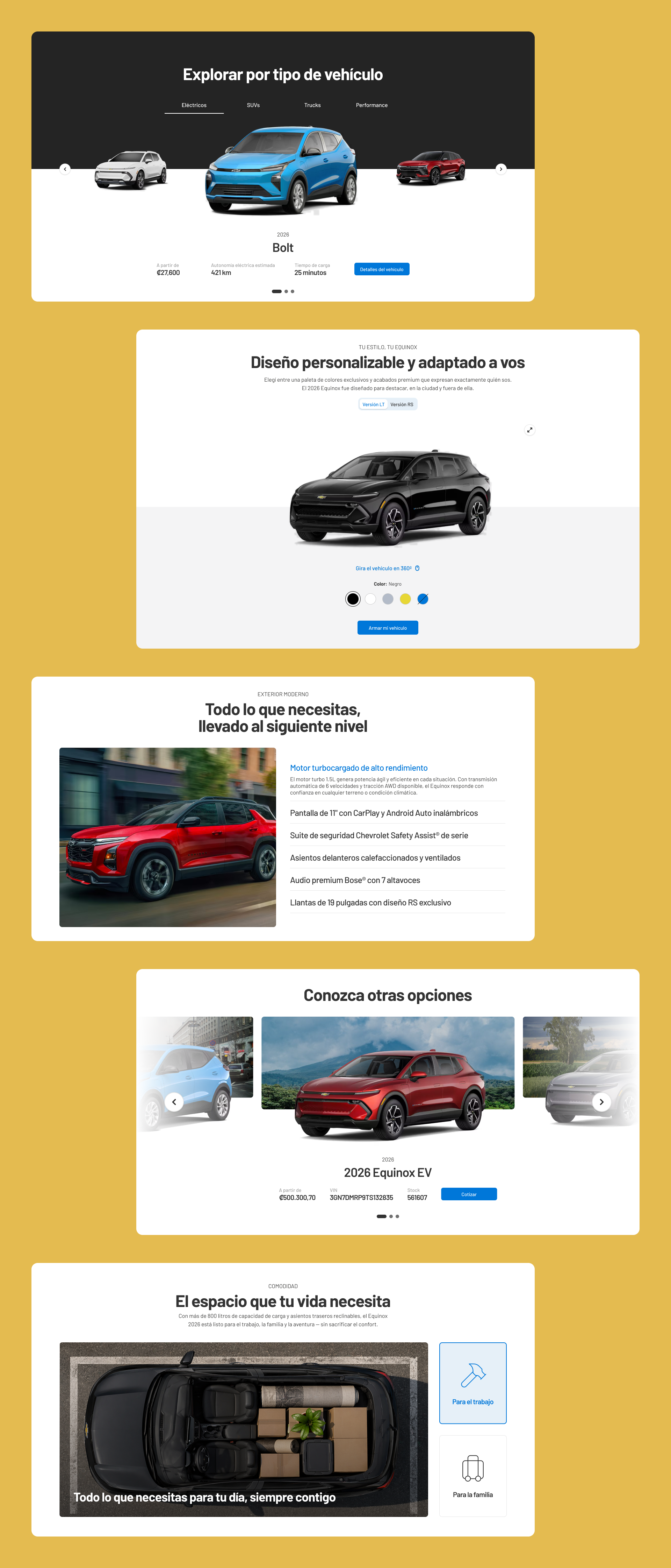
I led the UI direction for the commerce template and developed the first expression around one reference brand. I designed the home, product listing, product detail and checkout foundations, but this case focuses on the moments where interface design added the most value: comparing and configuring a vehicle.
The challenge
One system had to feel native to every brand
Vehicle commerce carries more variables than a typical online purchase. Model, version, drivetrain, color, interior and accessories can all change the product and its final price. At the same time, the interface could not feel generic when moving from one brand to another.
I needed to balance operational consistency with room for brand expression, while making every decision understandable in a high-consideration purchase.
The template
Reusable by structure, distinctive by brand
I defined a modular foundation in which hierarchy, spacing, interaction patterns and commerce behavior remain consistent. Typography, color, imagery and graphic details can then shift to represent each brand.
This approach gives product teams a shared language without forcing every storefront into the same visual personality. The first brand expression became a practical reference for how future storefronts could be configured.
Checkout
I turned checkout into a product experience
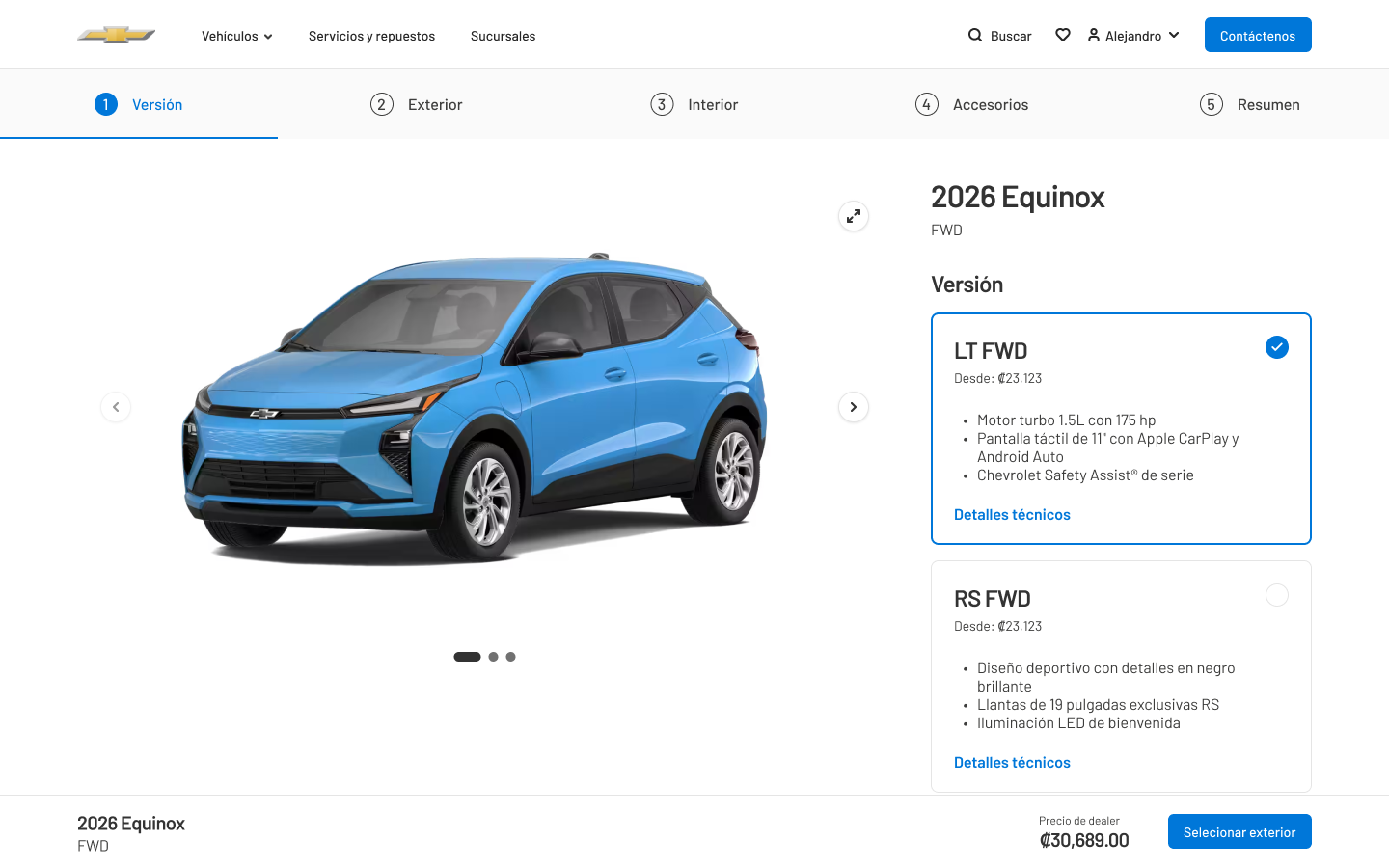
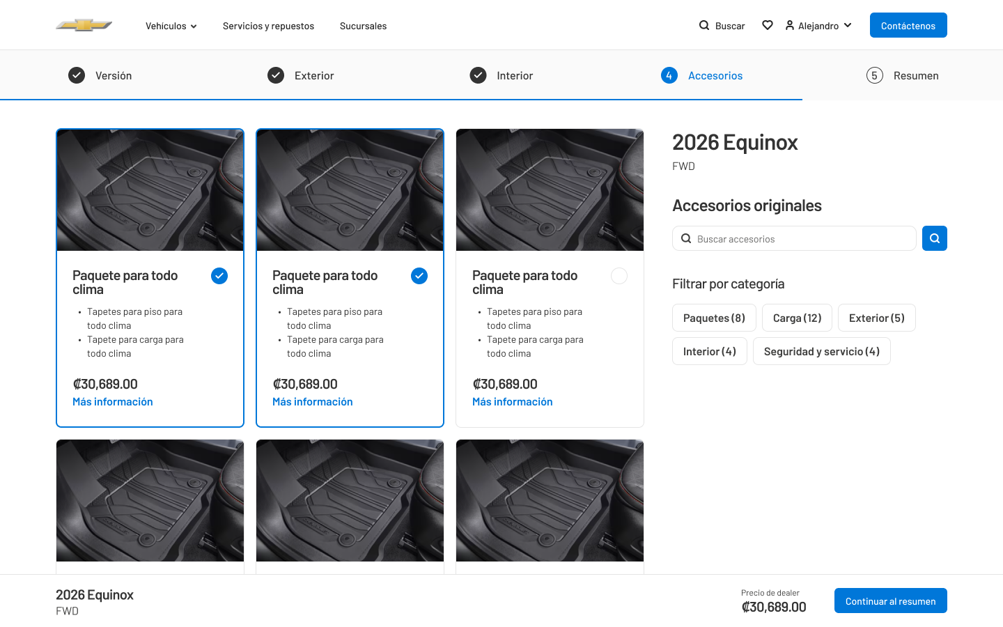
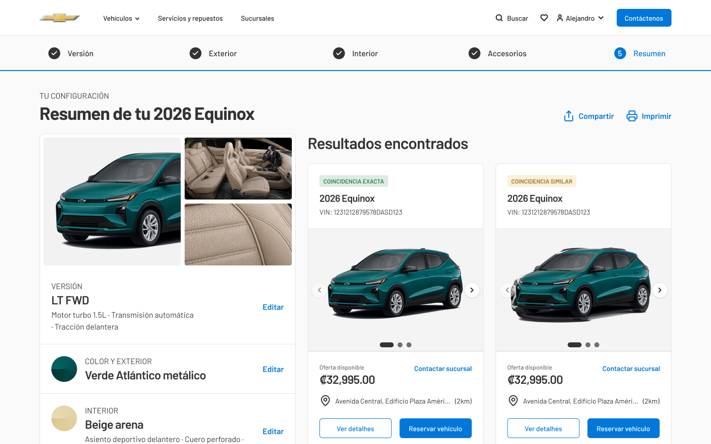
Instead of treating checkout as a sequence of forms, I designed it as a guided configurator. The vehicle stays in focus while each decision produces immediate visual feedback and updates the persistent order summary.
Animated transitions clarify what changed between versions, colors and finishes. Movement supports comparison and continuity rather than acting as decoration.
Exterior
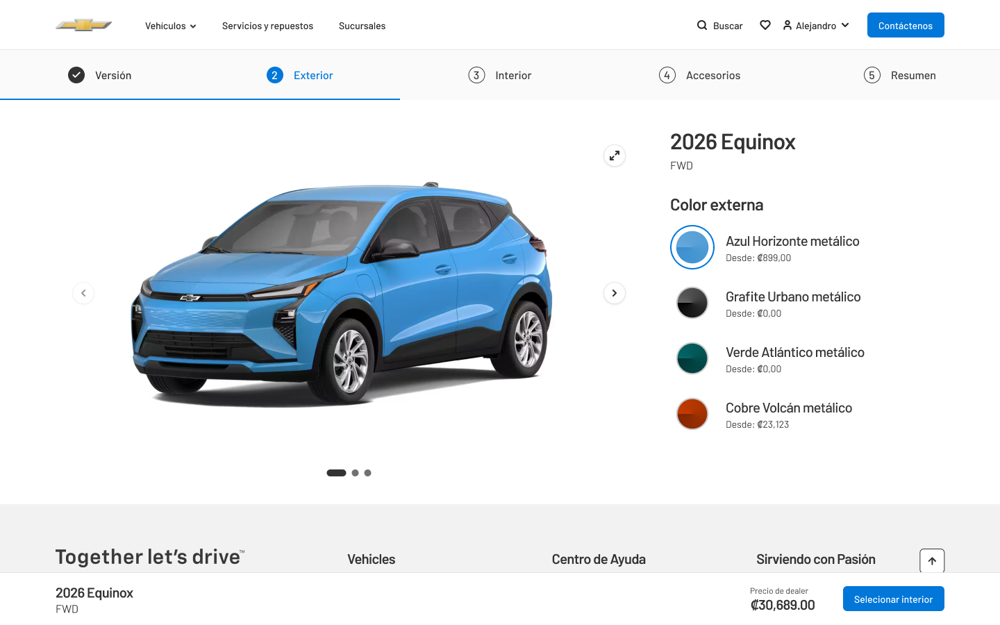
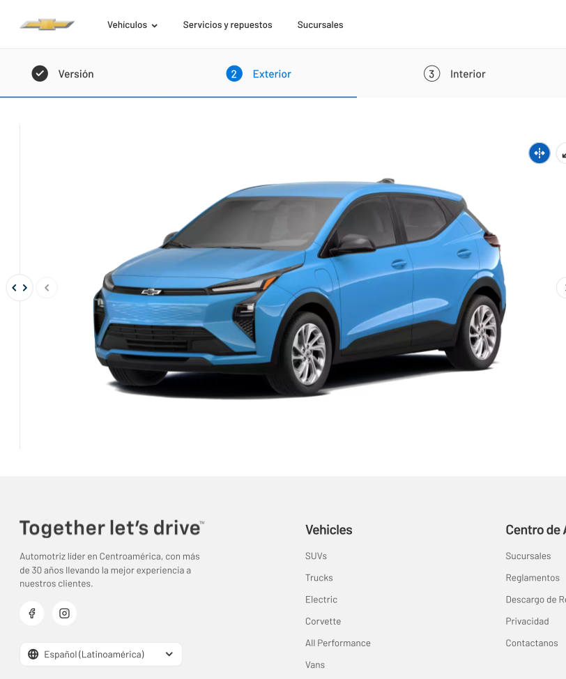
Color became an immediate visual decision
I made color selection feel direct: the vehicle updates in place with a smooth transition, so customers can explore combinations without losing their position or opening another screen.
The selected finish, price impact and order summary stay synchronized, turning an abstract option into a visible choice.
Interior
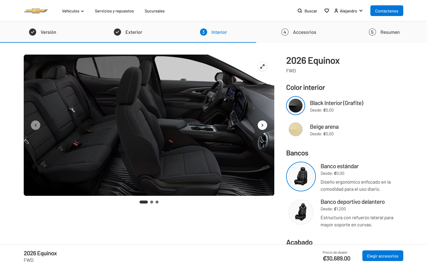
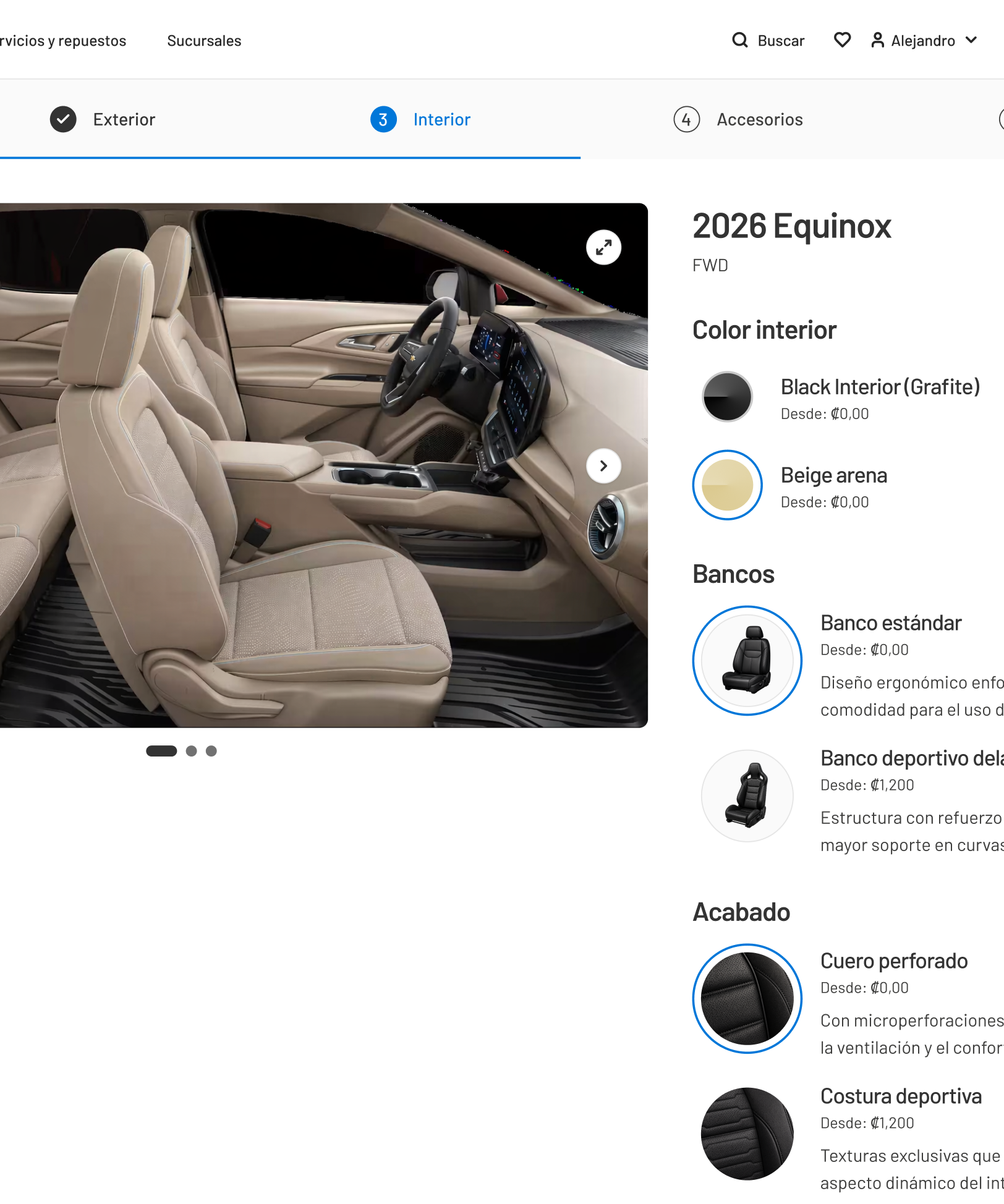
The interface moves from bodywork to cabin
When customers reach interior options, I shift the viewpoint into the cabin while preserving the same configurator structure. Materials and tones can be compared in context instead of as isolated swatches.
This continuity keeps personalization understandable and reinforces the feeling of building a vehicle of your own.
Outcome
A scalable foundation without a generic experience
I delivered a coherent UI direction for a commerce template that could scale across the group's brand portfolio. The foundation keeps navigation and interaction patterns consistent while leaving room for each manufacturer to feel distinct.
The checkout became the clearest expression of that idea: a reusable structure that still makes comparison, color and interior choices feel specific, responsive and personal.