Turning a redesign into a confident launch, backed by evidence
A moderated usability study for Meridian Executive Education, run across two very different audiences, that separated launch-blocking bugs from polish and pinpointed the redesign's single biggest win.
Context
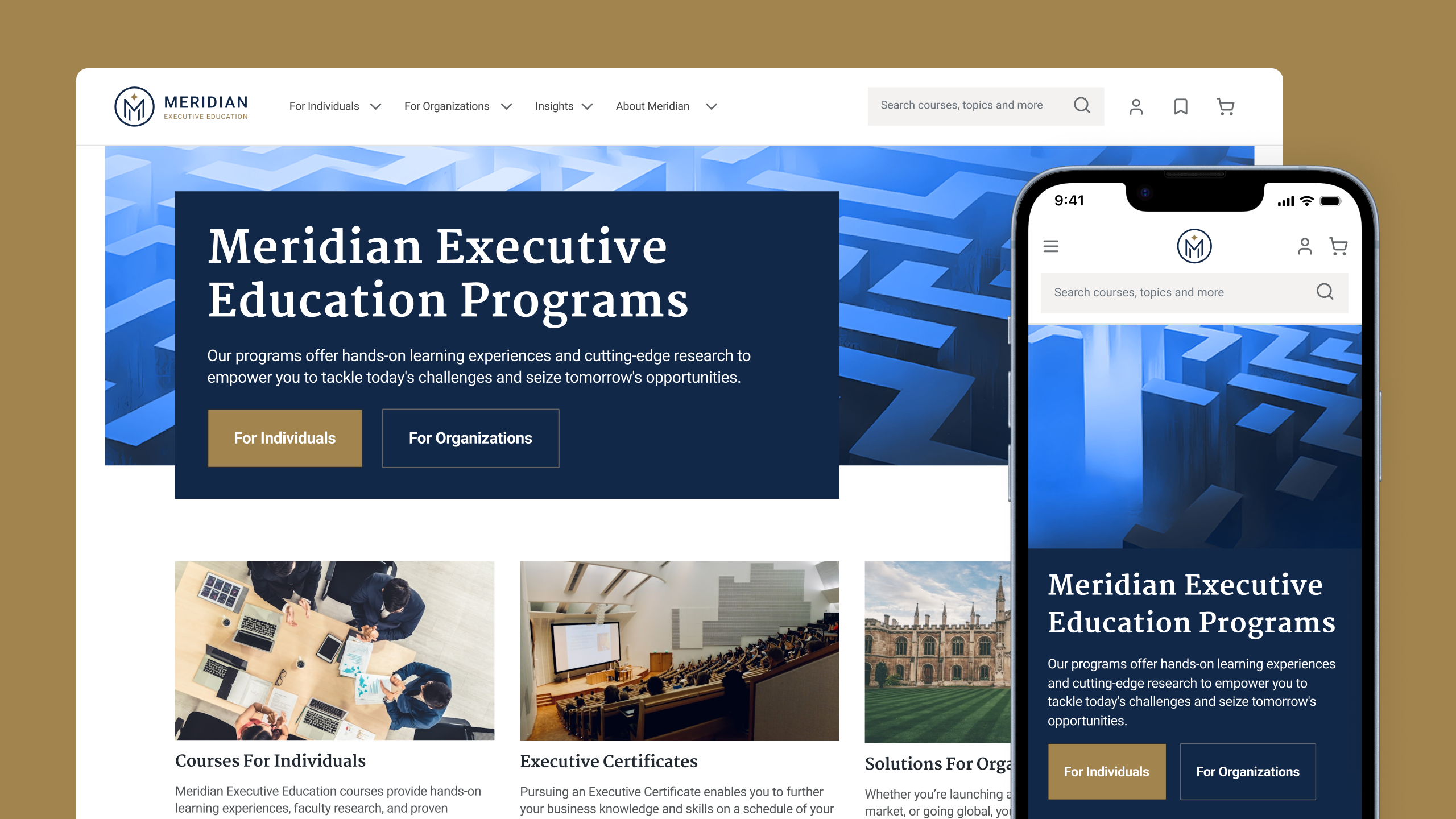
Meridian Executive Education had just redesigned its site after an extensive discovery phase. Before committing the new experience to two audiences with opposite goals, the redesign needed to be pressure-tested against real tasks, not opinions.
Impact
A two-cohort study that confirmed the redesign was fundamentally sound, separated launch-blocking bugs from content and polish, and pinpointed the certificate journey as the highest-value fix.
My role
Lead UX Researcher. I designed the protocol, recruited and screened across two cohorts, moderated the sessions, synthesized the findings, and prioritized recommendations by severity.
Highlights
- Designed and led a 16-participant study across two audiences
- Piloted, then tightened a 7-task protocol down to 4 focused tasks
- Tested desktop and mobile, remote and moderated
- Surfaced the course-vs-certificate confusion as the top fix
Context
A new site, two audiences with opposite goals
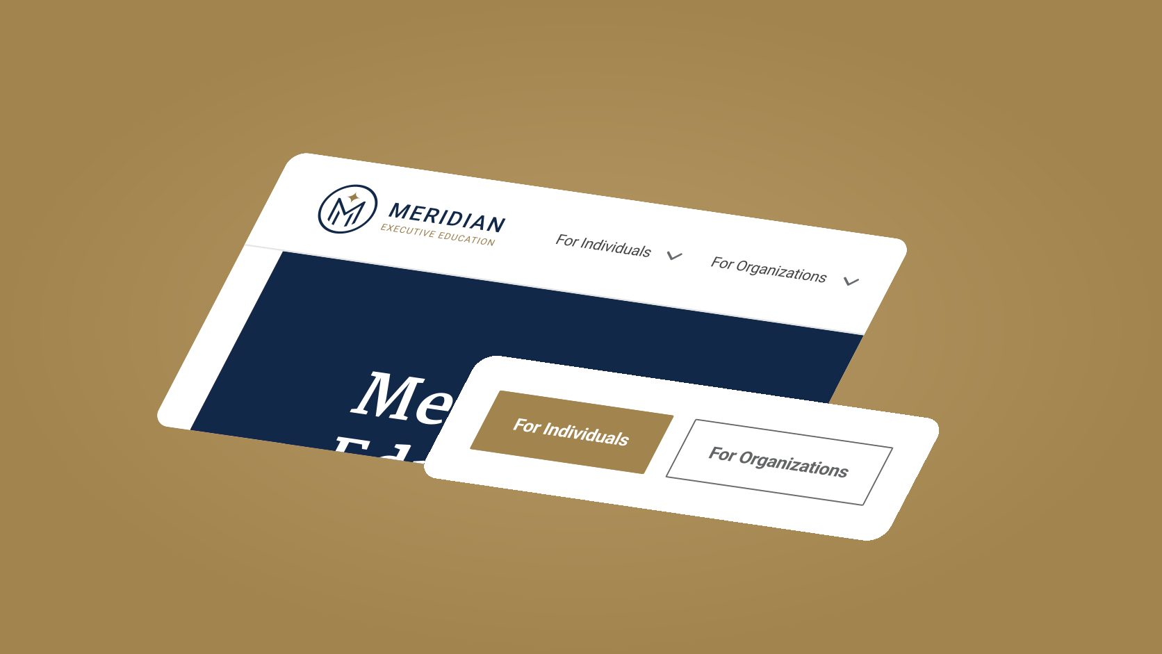
Meridian serves two audiences who barely overlap. Individuals browse and enroll in open-enrollment courses and certificates for themselves. Organizations commission custom programs to upskill entire teams. A discovery phase had already reshaped the site; my job was to find out whether the new experience actually worked for both, before users met it in the wild.
The stakes were not "do people like it?". The redesign was about to go live, and the business needed to know exactly what shipped as-is and what had to change first.
The challenge
Know what blocks launch, and what is just polish
A redesign can look modern and still hide friction in the flows that matter most: comparing courses, understanding what a certificate requires, enrolling a team at the right price. The real question was which of those problems were launch-blockers, and which were improvements we could sequence after go-live.
My job as lead was to structure research that answered this with evidence and severity, not a flat list of complaints, so the product and design teams could act on it immediately.
How I ran it
Remote, moderated, and deliberately tightened
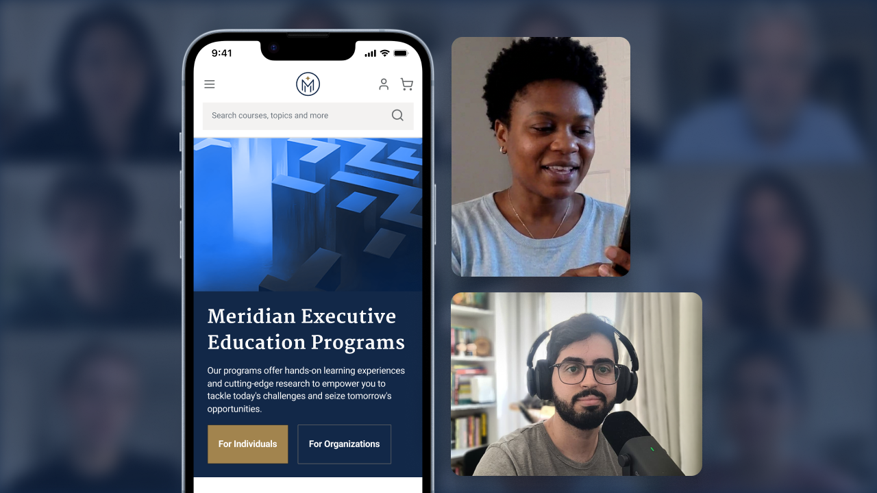
I ran remote moderated sessions with screen share and webcam, so I could see both hesitation and on-screen behavior, not just outcomes. The study covered two cohorts recruited and screened separately, and tested both desktop and mobile, because the two behave very differently under real tasks.
- For Individuals. 10 participants, a mix of experienced and first-time users.
- For Organizations. 6 participants, all with prior experience on the site.
- A protocol I cut in half after piloting. The first two sessions showed 7 tasks did not fit an hour, so I consolidated to 4 focused tasks: enough to exercise the highest-stakes flows without rushing people.
What we tested
The flows that actually carry the business
Each task exercised a decision the site exists to support, so a failure meant real revenue risk, not a cosmetic gap.
- Individuals. Find an online course and review enrollment options; find and enroll in a certificate program; enroll themselves plus two colleagues at the best team price; find a course in a specific city and month and start enrollment.
- Organizations. Identify educational-partnership programs; find an upskilling program for a team of 15 to 20 within budget; research a custom transformation program; enroll a small team of executives at the best price.
What the sessions revealed
A sound foundation, with friction that clustered
The redesign held up. Satisfaction and completion were solid, and the failures grouped into a handful of themes instead of scattering as noise, which is exactly what tells you where to act.
- Organizations: roughly 8/10 satisfaction and 92% completed every task, the strongest part of the experience.
- Individuals: 7/10 for experienced users, 6/10 for first-timers; 63% of experienced users completed all tasks.
- Mobile: 55% completed all tasks, usable, but clearly the weaker surface.
The desktop menus were oversensitive, opening and closing on me
My filters reset the moment I navigated away
Loved being able to compare courses side by side
The course pages were dense and hard to scan quickly
I could not tell a course apart from a certificate
I was not sure how enrolling my whole team would price out
Felt uneasy typing in a colleague's email
Getting redirected to another site made me second-guess it
The month view on mobile was hard to work with
Looks modern and on-brand, but the imagery feels generic
“People understood the site. What they could not untangle was the difference between a course and a certificate, and which courses counted toward one.”
The insight that set the top priority
The key insight
The certificate journey was where people got lost
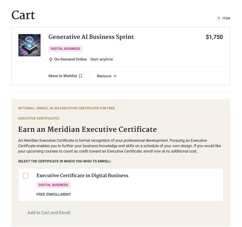
Across both experience levels, the certificate journey produced the most failures and the clearest opportunity. Participants recognized the value of certificates but struggled to tell them apart from individual courses, and to understand how to enroll into a track.
Everything else was friction. This was a comprehension gap, and it was worth solving first.
From findings to priorities
Sorted by what launch could tolerate
I handed the teams recommendations ranked by severity, so the roadmap fell out of the research rather than out of debate.
- Fix before or at launch (bugs). Menu sensitivity, filters not persisting, and hero heights, all addressable without new design.
- Clarify the certificate model. Distinguish course from certificate and make "what counts toward this track" explicit, the highest-value change.
- Improve scannability. Denser cards, short descriptions, and rating counts so people can evaluate at a glance.
- De-risk the multi-participant flow. Make team pricing and next steps visible, and reassure users when entering colleagues' details.
- Sharpen mobile. Starting with a full month view in the calendar.
Outcome
A validated redesign, and a plan the teams could act on
The study confirmed the redesign was fundamentally sound: the problems were mostly incremental, not critical. Items that were true bugs were resolved during hardening, and the remaining recommendations were largely content and clarity work.
- A clear read on what to ship as-is and what to fix first, ordered by severity.
- The certificate journey identified as the single highest-value improvement.
- The few development items reused existing components, so they needed no major new design.
- A launch the teams could make with confidence, plus a prioritized backlog for what came next.
Reflection
Severity is the deliverable
Leading evaluative research for two opposite audiences reinforced something simple: the value is not in listing what is wrong, it is in telling a team what blocks launch versus what is polish.
Piloting and cutting the protocol from seven tasks to four made the sessions sharper, and separating bugs from comprehension gaps let the certificate insight rise above the noise instead of getting buried in it.