Making a complex care portal feel clear and trustworthy
A UX/UI discovery and redesign for a financially sensitive portal in the health and care sector, used by four very different kinds of user.
Context
CareFlow is a financially sensitive portal where participants, guardians, providers, and support coordinators manage care-plan budgets and invoices. It worked, but friction was pushing users to call support to finish simple tasks.
Impact
A UX/UI discovery that turned a vague “the portal is confusing” into a prioritized, evidence-based redesign plan, delivered as a high-fidelity interface where every decision traces back to a real finding.
My role
Lead Product Designer. I led the discovery, defined the method, synthesized the insights, and directed the deliverables, alongside a Head of Design and one supporting designer.
Highlights
- Turned scattered friction into a prioritized redesign plan
- Clarified hierarchy, actions, charts, and mobile flows
- Balanced the needs of four very different user profiles
- Delivered a high-fidelity UI ready for implementation and testing
Context
A financially sensitive portal, four very different users
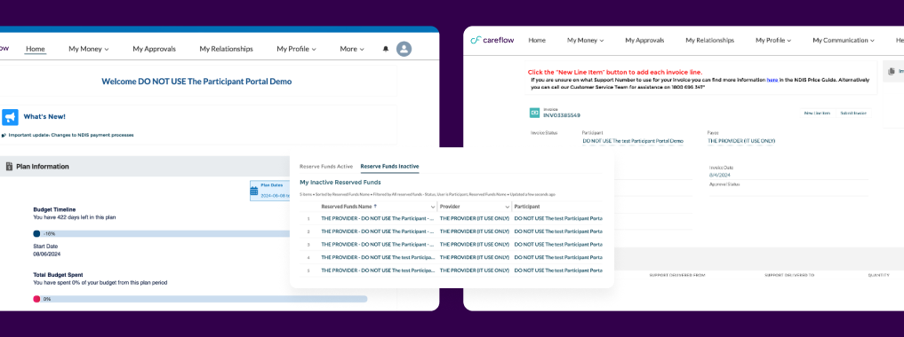
CareFlow is the portal where participants, their guardians, service providers, and support coordinators manage budgets, approve invoices, and track how the funds in their care plans are used. It's a financially sensitive product used by very different people, from users with little tech familiarity to professionals who live inside the platform all day.
The portal worked, but it kept accumulating friction. Users felt overwhelmed, couldn't find important actions, and often had to call support to finish simple tasks. Before redesigning a single screen, the question was: why?
The challenge
Clarity for four users with opposite needs
How do you turn a dense, inconsistent, hard-to-navigate portal into a clear and trustworthy experience, for four user types with opposing needs, without breaking what already worked?
My job as lead was to structure a discovery that answered this with evidence, not opinion. Not “we think screen X looks bad”: I needed data, testable hypotheses, and clear priorities to steer the redesign.
Discovery signals
The problem was not one bad screen. It was repeated friction.
I structured the discovery around a UX/UI audit, user journeys, interviews, personas, and information architecture. The goal was not to document every method in isolation, but to turn a broad complaint, “the portal is confusing”, into clear product signals.
The audit showed recurring patterns across screens and across the four profiles. Primary goals were hard to identify, CTAs and links changed appearance through the product, help lived mostly in hard-to-search videos, empty states did not guide users, and some menu items appeared for people who could not use them.
Six one-hour interviews, with 2 participants, 2 guardians, 1 provider, and 1 support coordinator, confirmed the same areas of friction: charts, filters, the mobile experience, poor information architecture, and a long learning curve.
It lacks instructive information
There are a lot of filters which can sometimes be confusing
Mobile experience works for specific features
Hard to navigate on phone, got stuck when trying to go up or down
Terminology was confusing
Mobile struggles to load
Homepage confusing, too much information
Often need to contact someone to understand, which is time consuming
Find it hard to interpret and navigate charts
A lot of steps to find the right details
Design decisions
Turning findings into decisions the product could act on
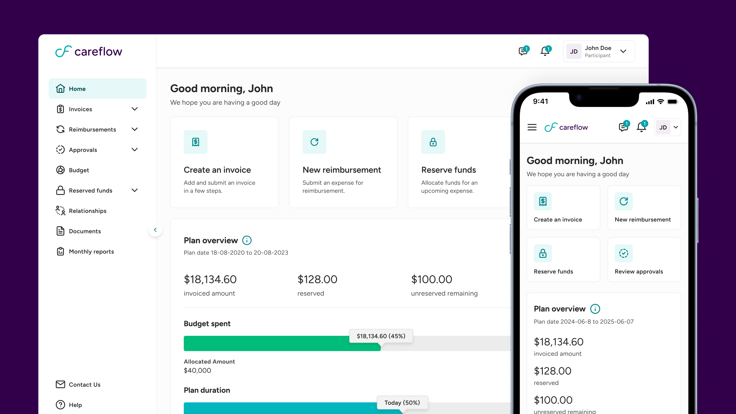
The research gave me a simple direction: reduce simultaneous information, make primary actions unmistakable, clarify navigation, improve data readability, and make mobile capable of real tasks. Each decision in the redesign traces back to one of those findings.
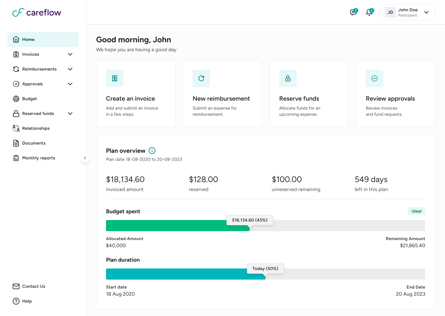
- Too much information competing for attention. I reorganized the homepage around clearer hierarchy and the main action of each screen.
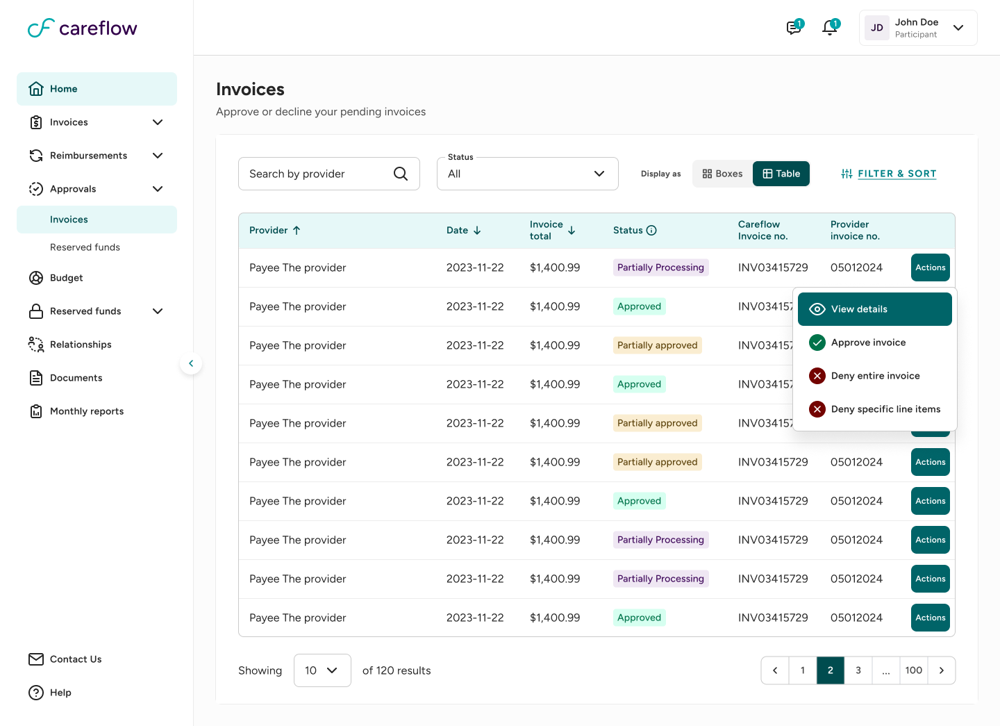
- CTAs and links changed across the portal. I created a consistent pattern for buttons, links, cards, and states.
- Users had trouble reading charts. I redesigned budget views for faster reading, with color-coded statuses and access to real numbers alongside percentages.
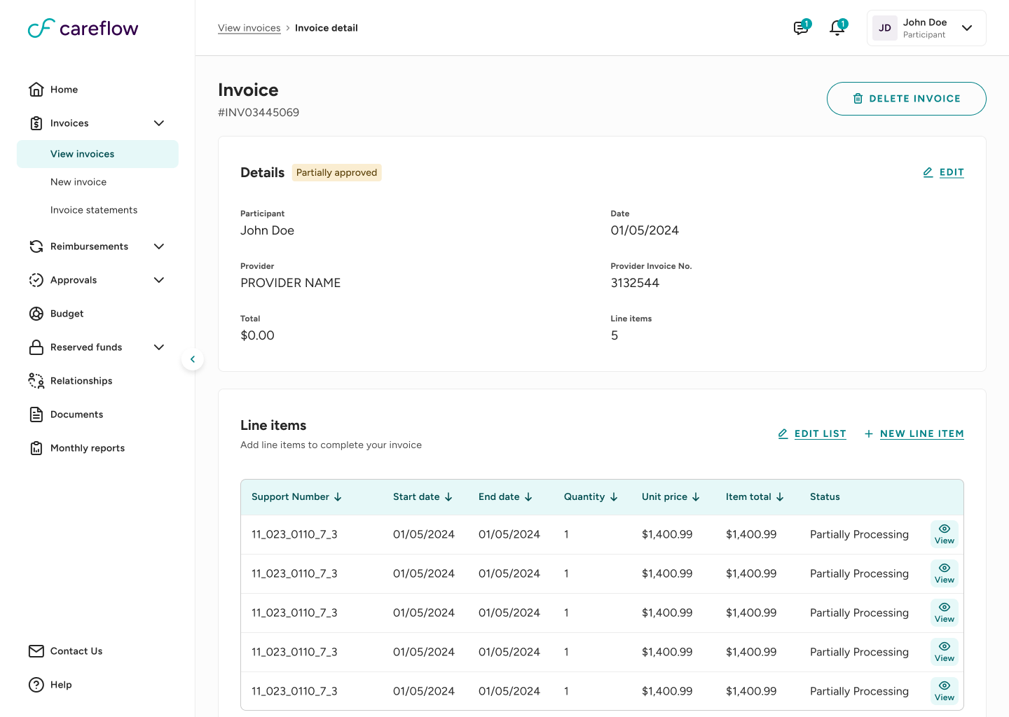
- Important actions were hard to find. Creating invoices, approving invoices, and reserving funds gained more visible CTAs and contextual help.
- Mobile users got stuck. The responsive interface was redesigned to support both simple and complex tasks.
The redesign
A clearer experience for people with very different needs
The personas and journeys kept the redesign grounded in the tension between opposite profiles: a participant trying to stay independent, a guardian learning the portal from scratch, a coordinator who needs fast and accurate information, and a provider focused on submitting invoices and getting paid on time.
Before moving into high fidelity, I used wireframes to validate hierarchy, task priority, consistent page structure, and responsive behavior. The final UI then turned those decisions into a more confident, easier-to-scan portal.
Outcome
From “the portal is confusing” to a validated redesign direction
The discovery transformed a vague problem into a prioritized, evidence-validated action plan. The final UI made that plan tangible, giving the client confidence to move into the next phases of implementation and user testing.
- A clear diagnosis of what to preserve and what to correct, ordered by priority.
- A deeper understanding of four user profiles and their real journeys.
- A new information architecture to guide the product.
- A high-fidelity interface where each visual decision traces back to a real problem.
Reflection
Designing for opposite profiles sharpened the work
Leading this project reinforced that strong design decisions come from evidence, not opinion. The audit generated hypotheses, the interviews validated them, the journeys and personas added depth, and the UI closed the loop.
The hardest and most valuable part was balancing opposite needs: what helps an experienced coordinator can overwhelm a first-time participant. Keeping that tension visible shaped the redesign from discovery to final interface.